相信大家对Toobar已经很熟悉了,这是android系统在5.0版本中推出的新控件,这里有有篇比较详细的介绍,不太明白的可以看看android:ToolBar详解(手把手教程)
接下来说今天的重点,怎么定制你的Toolbar
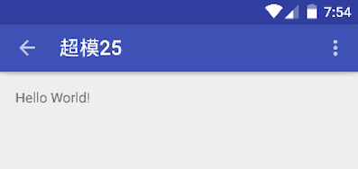
很多app有自己的主色(非白),就像新建一个项目系统自动生成的默认页,如下图: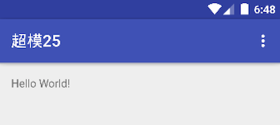
我们来看一下布局代码
<android.support.design.widget.AppBarLayout
android:layout_width="match_parent"
android:layout_height="wrap_content"
android:theme="@style/AppTheme.AppBarOverlay">

       <android.support.v7.widget.Toolbar
        android:id="@+id/toolbar"
        android:layout_width="match_parent"
        android:layout_height="?attr/actionBarSize"
        android:background="?attr/colorPrimary"
        app:popupTheme="@style/AppTheme.PopupOverlay"/>

</android.support.design.widget.AppBarLayout>
接下来是样式
|
|
我们给
AppBarLayout:android:theme="@style/AppTheme.AppBarOverlay",
Toolbar:app:popupTheme="@style/AppTheme.PopupOverlay"
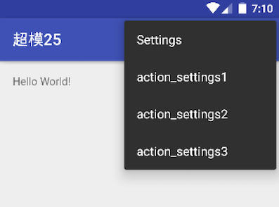
Android 5.0引入一个全新的特性,允许你对view设置theme,这种设置会影响控件及其包含的子控件。这里对AppBarLayout的android:theme设置就有这种效果,而且系统目前只提供了两种默认的主题,Dark和Light,这里要说明的是android:theme如果设置的Dark主题,ToolBar的Title显示的是白色,如果设置的Light主题,Title是黑色,有点奇怪)
那有人在想,app:popupTheme又是干嘛的呢?问得好,这里的app:popupTheme是设置菜单的样式的,也有下面两种设置方式
- ThemeOverlay.AppCompat.Light
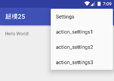
- ThemeOverlay.AppCompat.Dark
上面的说的一些基本情况,如果我们要定制一些特使的Toolbar呢,接下来介绍几种定制的情况
Toolbar的背景
直接在xml配置下Toolbar的背景就好了
1android:background="@color/window_background"Toolbar的高度
系统默认取的是
android:layout_height="?attr/actionBarSize"通过代码可以可知系统默认toolbar的告诉是
56dp,很多app都觉得有点厚了,比如微信,网易,想把高度改小一点,比如48dp,该怎么改呢?直接定义Toolbar的告诉不就好了,1android:layout_height="48dp"效果是这样
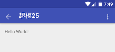
这里为了更直观的看到问题,我把返回按钮放出来了,发现问题了吧,返回键和menu键和title没有对齐,oh,no,这也太丑了,怎么解决呢,很简单,给toolbar加一句代码就好了
android:minHeight="48dp"搞定!
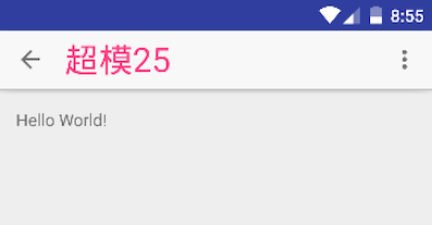
Toolbar title的颜色和大小
其实这里我们Toolbar的背景不为白色的话,其实是不需要定制的,直接采用系统的Light主题就OK了,但是如果设计非要弄个白色,而我们又不喜欢Dark主题的纯黑字体,或者其他原因,那我们就只能自己定制了
大家应该和我一样,第一想到的是跟定制ActionBar一样,在style文件里配置一下不就好了吗?就像这样
|
|
事实是根本不起作用。。
笔者尝试了很多种利用样式来改变的方式,都失败了,所以想了一种比较笨的方法,下面介绍一下,思路很简单,直接上代码
<android.support.v7.widget.Toolbar
    android:id="@+id/toolbar"
    android:layout_width="match_parent"
    android:layout_height="48dp"
    android:background="@color/window_background"
    android:minHeight="48dp"
    app:popupTheme="@style/ThemeOverlay.AppCompat.Dark">

    <TextView
        android:id="@+id/tv_title"
        android:layout_width="match_parent"
        android:layout_height="match_parent"
        android:ellipsize="end"
        android:gravity="left|center_vertical"
        android:singleLine="true"
        android:textColor="@color/colorAccent"
        android:textSize="28sp"
        tools:text="更多"/>
</android.support.v7.widget.Toolbar>
通过在BaseActivity里对外提供title设置方法
|
|
如果有些子标题,也可以在toolbar下定制,为了看看效果,此处把字体设大了些,如图
以上就是我对定制toolbar的一些见解,如果你有不同的思路,请给我留言,一起探讨更好的方法